24 Jan UND’s new, user-friendly dashboards are designed to give faculty and staff good data for making decisions

UND Provost Tom DiLorenzo, center, and Chief Data Officer Amanda Moske, in yellow, pose with members of the University Analytics & Planning team. Photo by Connor Murphy/UND Today.
Go to UND.edu.
Search the term, “UND dashboards.”
And if you’re a UND faculty or staff member, discover a whole new reason to appreciate UND’s striking and remarkably useful website.
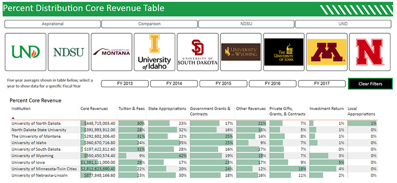
Thanks to the efforts of University Analytics & Planning, faculty and staff who make their way to the UND Dashboards page will find up-to-date, at-a-glance graphics that track many of the University’s most important performance indicators. These include retention trends, enrollment numbers, grade distributions (A-F) by course number, and applicants-to-date for next year’s freshman class, among many other data sets.

Tom DiLorenzo
As Wikipedia notes, “the term dashboard originates from the automobile dashboard, where drivers monitor the major functions at a glance via the instrument cluster.” That describes the University Analytics & Planning dashboards exactly, said Tom DiLorenzo, UND’s provost and vice president for academic affairs.
Because just as drivers use the speedometer, odometer and other instruments on a car’s dashboard to make decisions, so, too, can department chairs, deans, faculty members and others use the UND indicators to help them find the best route forward.
“We recognized early on that we needed really good data,” DiLorenzo said. “That’s because we want people to make data-driven decisions.”
The new dashboards, in turn, put that key information into understandable and usable form.
“It’s really impressive,” DiLorenzo said.
“I’ve been to many national meetings over the past couple of years. And what we’re doing is the best I’ve seen anywhere. … This is actionable data, where we can not only understand it but also do something with it. It has provided us with lots of information that help us do a better job of recruiting students, retaining students and ensuring students’ success.”
Strategic thinking
Amanda Moske, Chief Data Officer, was made aware of the need even before she was hired, which happened in September of 2018.
Amanda Moske
“When I was interviewing for this position, one of the things that they stressed heavily – and that I even did an Open Forum on – was the use of data analytics for the strategic plan,” Moske said.
“They made it very clear that we needed to provide data that was both accurate and timely, and that also could be acted upon.”
Then when Moske arrived, “I found that the dashboard product we were using was very clunky. It was not user-friendly, which meant some of the dashboards hadn’t been updated in years.
“And so faculty and staff were frustrated, rightfully so.”
Another challenge was the need to source the data for the user to see. For users, getting numbers or seeing a graph is just the starting point. Where did the numbers come from? How current is the information that went into building the graph?
Knowing such key pieces of information is vital for the data to be truly useful, Moske noted.
Then there was the issue of terminology, a challenge with all databases. “For example, you wouldn’t believe how many definitions there are of just the word, ‘student,’” Moske said.
“There are undergraduate and graduate students. Students who live in residence halls and students who don’t. Degree-seeking and non-degree-seeking students, and so on.”
Databases with poorly defined terms force users to spend time at every meeting making sure all participants are on the same page. “You’d spend 30 minutes or so just discovering that, OK, you’re looking at this group of students and I’m looking at that group, and that means we can’t really move forward,” Moske said.
As a result of the above, Moske and her team have spent the past year building the new dashboards in ways that overcame these hurdles.
For example, the team studied and priced various software options. They settled on Power BI, a Microsoft-based business analytics product that they knew would be much easier for the team to update and for UND staffers to access and use.

UND Dashboards screenshot.
In addition, all of the new dashboards have a “Read Me” tab. “That’s where we state what the data source is, as well as the last time the dashboard was updated and the data was refreshed,” Moske said.
“Also, we list any variable definitions that we’re using as part of the tables and visualizations that we have.”
Speaking of definitions, each of the terms used in the datasets was chosen with care. “Typically, the first thing I look at is IPEDS, the Integrated Postsecondary Education Data System,” Moske said.
That’s the U.S. government’s system for all institutions that use federal financial-aid funds. “We rely primarily on the IPEDS definitions – first, because they’re the federal standard, and they allow us to compare ourselves against our peers,” she noted.
And second, because the IPEDS data gives UND a consistent set of numbers that can be tracked over time.
But IPEDS alone isn’t enough. For example, UND is now undergoing the Year of Retention, and the dashboards have lots of data about that topic – right down to the level of the retention numbers of UND’s individual Greek houses and athletic teams.
But IPEDS defines retention very specifically: as first-time, full-time incoming freshmen who return to their institution the following fall.
“Then (Associate Graduate School Dean) Chris Nelson asked, ‘Could we track the retention rate for grad students?’” Moske recalled.
The answer was yes, but for clarity’s sake, the data would have to be called something other than “retention.” “So, we now have a ‘Graduate Return Rate,’” Moske said. “We have a couple of years of data out there. The deans and department heads can see trends, and everyone’s really excited,” in part because the terms have been precisely defined.
UND Dashboards screenshot.
Data Fellows
Elizabeth Legerski has a special perspective on all of this. An associate professor of sociology, Legerski is the Data Fellow for the UND College of Arts & Sciences. That means she – like her counterparts, one from each of UND’s colleges – is a designated contact person, someone who has been trained in the dashboard’s functionality and can help colleagues find the information they need.
Liz Legerski
Legerski’s view?
“I think they’re really an excellent resource,” she said.
“There is so much useful data, and it’s so well presented. The dashboards can help everyone make data-informed decisions about course offerings, teaching loads, revenue projections and so many other things.”
Faculty and staff who haven’t yet checked out the dashboards should do so, because they’re sure to be impressed, Legerski said. “They’re much easier to use, and the information is much more readily available than it used to be.”
Provost DiLorenzo agreed. “These dashboards are meant for faculty, staff and administrators at all levels,” he said.
The University Analytics & Planning team “has done a fabulous job, and this is an ongoing project now. They’re developing more and more dashboards and incorporating more and more data – and that’s helping us recognize more and more patterns and practices that contribute to student success.”